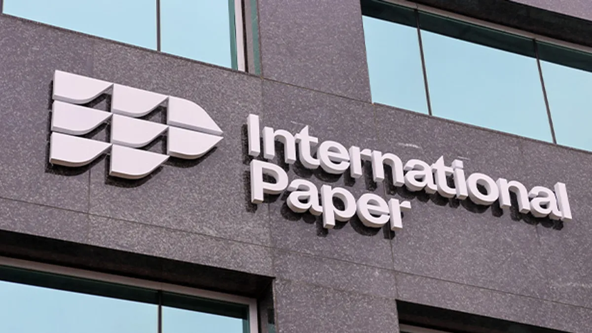
This year, International Paper is undergoing a company rebrand in conjunction with its 125th anniversary. It recently rolled out the key elements of the revamp: a new logo and a new corporate website.
Other external-facing items such as customer materials also have changed, and IP will next examine its internal systems to bring them into alignment with the rebrand. For example, invoices will get the new branding, and facility signs will be changed over the course of the next two years.
This has been a major effort for a company whose previous logo stood as a well-known brand representation for six decades, executives said. The rebrand also sharpens the focus on newer company priorities, like innovation and sustainability.
Packaging Dive spoke with Director of Communications Jessica Seidner and Senior Manager of Corporate Communications and Marketing Amy Simpson about the rebrand, including why IP took a risk after decades of building brand recognition and how this ties into modern sustainability initiatives.
The following interview has been edited for length and clarity.
PACKAGING DIVE: What is the significance of the company reaching the 125-year milestone and the significance of the rebrand?
JESSICA SEIDNER: Reaching a milestone like this really speaks to the resiliency of the company, and it shows that we've had to evolve over the years to be successful. We started in 1898 with 17 paper mills that came together to form this company. And today, we've got multiple businesses. We've got 39,000 employees, operations across the world serving customers around the world, so we're a much different business today than we were back then.
We did the rebrand for a number of reasons. You may be familiar with the fact that it's been about two years now since we refocused our company pretty significantly. We zeroed in on two business lines, our corrugated packaging business and our pulp business or cellulose fibers business. It changed our trajectory and focus very much as a company. That, along with this 125-year milestone, is what triggered the need to look at our brand again and say: The brand that we’ve had for almost 60 years — is it what we need to take us into this next 125 years, the next chapter for IP?
We decided after looking at our strategy that we needed to look at the brand a little differently. We took this as an opportunity to do that, to focus on some new brand pillars — of sustainability, dependability, innovation — which we feel like are the things that are going to take us into the future.
AMY SIMPSON: It was a real collaborative team effort. We spent a lot of time and research asking our employees and asking our customers what they thought, what they liked, what they wanted out of it for the future, what did they value about working with us or working for us? We took all of those inputs and then worked on what that means for our brand narrative moving forward and what that means for who International Paper is — and how do you represent that visually?
Everything was very forest-driven, from a design perspective, which was very important to us in terms of making sure it represents who we are. With the logo I think you can really see that representation shine through. In particular, we call the little elements of the visual symbol “leaflets.” Those are representations of the leaves on a pine cone, which for International Paper is where everything starts. You can see the genesis there.
The color is one element we talked a lot about. Our employees were really the ones that helped us pick the color, and we wanted to make sure that it represented that value of sustainability, which is so important to us. You see the greens and blues in those elements start to come through.
Could you describe in more depth the effort you mentioned to bring sustainability to the forefront?
SEIDNER: The best place to focus for sustainability are our Vision 2030 goals. It was 2019 when we set our new goals focused on the year 2030. They're about making a better future for our stakeholders in four categories: healthy and abundant forests, sustainable operations, renewable solutions and thriving people and communities.
We’re very early in that process. We just wrapped up our Vision 2020 goals at the end of 2020, and we’re just now starting to measure progress against our new set of sustainability goals. We’re working on a sustainability report right now. Early in the summer, we'll have more concrete information that we'll be sharing around our progress toward those goals.
This rebrand sounds like quite an investment of time and other resources.
SEIDNER: We’re making an investment in our brand in a way that we haven't done for a while — we basically used the same logo symbol for about 60 years. I don't know how much you know about our old logo, but it's historic. It's iconic. People study it in graphic design school. So it was a big decision to move away from that.
But the more we got feedback from people and the more we involved people, we really felt like our company is shifting and changing enough at this moment in time that it really felt like it was time for a brand new look, a brand new way of talking about ourselves.

Did you have to do an extensive risk assessment? Based on what you just said about the iconic logo, it sounds like a rather risky move for the brand to pivot.
SEIDNER: Yeah, it was. Yet, it was time to do it. It was risky in the sense that we do have a lot of pride in that logo. It has a lot of meaning, especially for our employees and our retirees. But like I said before, the past two years really triggered that change.
We're much more agile than we used to be. We're much more focused on the customer than we have been at times. We're really changing and becoming a different kind of company than we used to be in a really positive way. We think the new branding reflects that. It gives a new sense of energy and excitement, and it really connects with younger generations — which we were very excited about because that's who's going to use this logo and use this branding for the rest of their careers.
You talked about the company’s evolution over time. Could you describe how IP balances maintaining 125 years of building brand recognition and trust with innovating to stay fresh and potentially bring in new customers?
SEIDNER: Looking back over this 125-year span, part of it is just in the reality that the business has changed to meet the needs of customers and consumers. For example, when we very first started, we were making newsprint — that was how everybody got their news. Today, it's very different. We're much more digital and we have other ways of doing things.
Over time, as trends have changed, as customers’ needs changed, we refocused, we evolved. We got into different business lines, we’ve bought companies, we’ve sold parts of our business to make sure that we are continuing to be relevant, continuing to innovate for our customers and be there for them long term.
How and when will you measure the success of this rebrand?
SEIDNER: We're looking at an implementation over the next two years. We have that time period to really get the brand implemented and to see some value come from that. [We’ll] do the measurement at the end of that time period.
Did you learn any lessons that you’d like to share with other companies trying to undergo a rebrand?
SEIDNER: The biggest lesson is to involve people. So many people have a stake in the brand ... and it's really important to take the time to listen to all of those views.
But you obviously can't satisfy everyone and what everybody wants. It's a very subjective process, in some ways. But it was a great exercise for our organizations to go through that together. I think it just shows how the diverse points can come together with a really great outcome.


