Companies constantly innovate with technology and redesign their packaging to get better performance, improve marketability and enhance sustainability. Here’s a look at five of the recent revamps on Packaging Dive’s radar.
Boneheaded coating
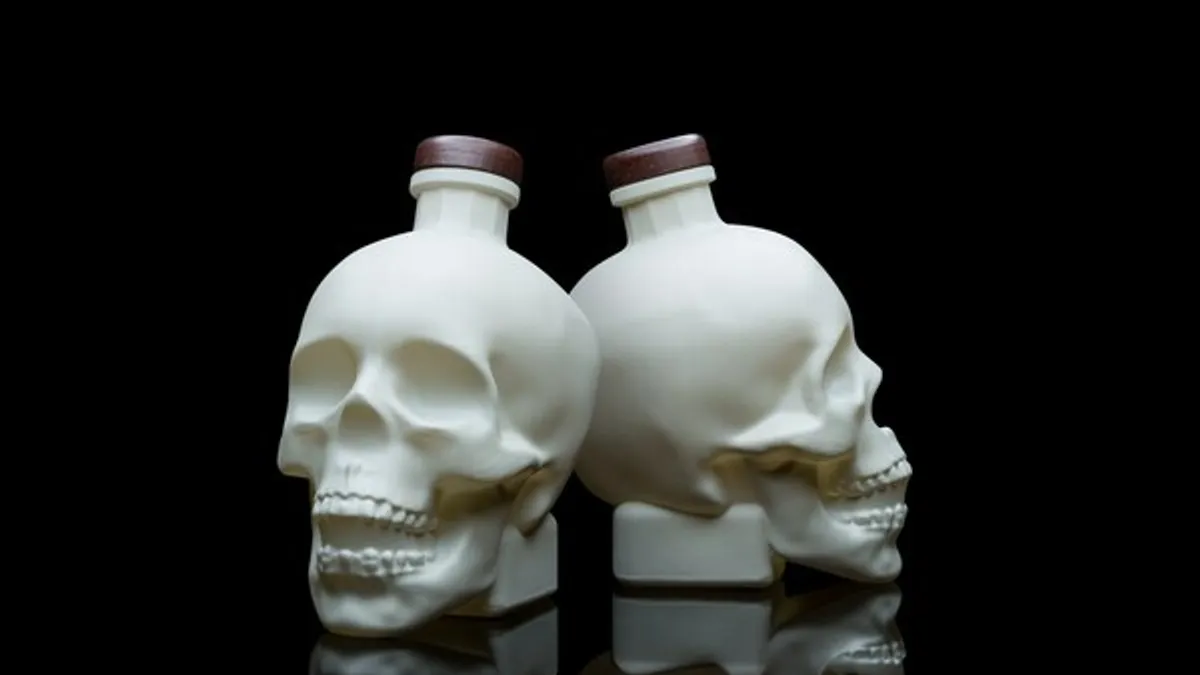
Crystal Head Vodka, whose adult beverage typically comes in a clear skull head bottle, is releasing 4,500 cases of a limited edition “bone bottle” ahead of Halloween. The chalky white ceramic coating mimics bone in a nod to spooky season, and it sports “creative mystique,” Dan Aykroyd, Crystal Head Vodka founder and actor, said in a news release. “This one-of-a-kind bottle design represents our brand's quintessential commitment to merging artistic expression and fun.”
Flipping the lid
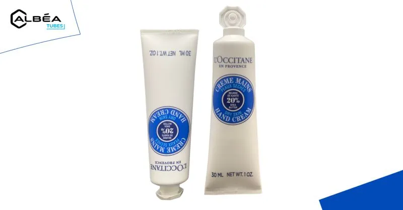
French cosmetics packaging company Albéa Tubes redesigned L’Occitane’s hand cream packaging and changed substrates, the packaging manufacturer announced on LinkedIn. The all-plastic laminate and HDPE multilayer sleeve solution replaces an aluminum barrier laminated tube. The peel seal closure and twist top will be replaced by Albéa’s OctoTop, a flip top made from HDPE that features L’Occitane’s octagonal shape.
The company said this tube is 23% lighter than the previous version and the entire tube is recyclable in existing PE recycling streams in the United States and Europe. Weight reduction and recyclability were “at the heart of this project and led us to simplify the tube as much as possible without compromising on esthetics and functionality,” David Bayard, R&D packaging director at L’Occitane, said in the post.
This project has been in the works for two years and the partners used a certified life cycle analysis to assess the environmental impact. The new tubes will begin rolling out in January.
Once in a blue moon
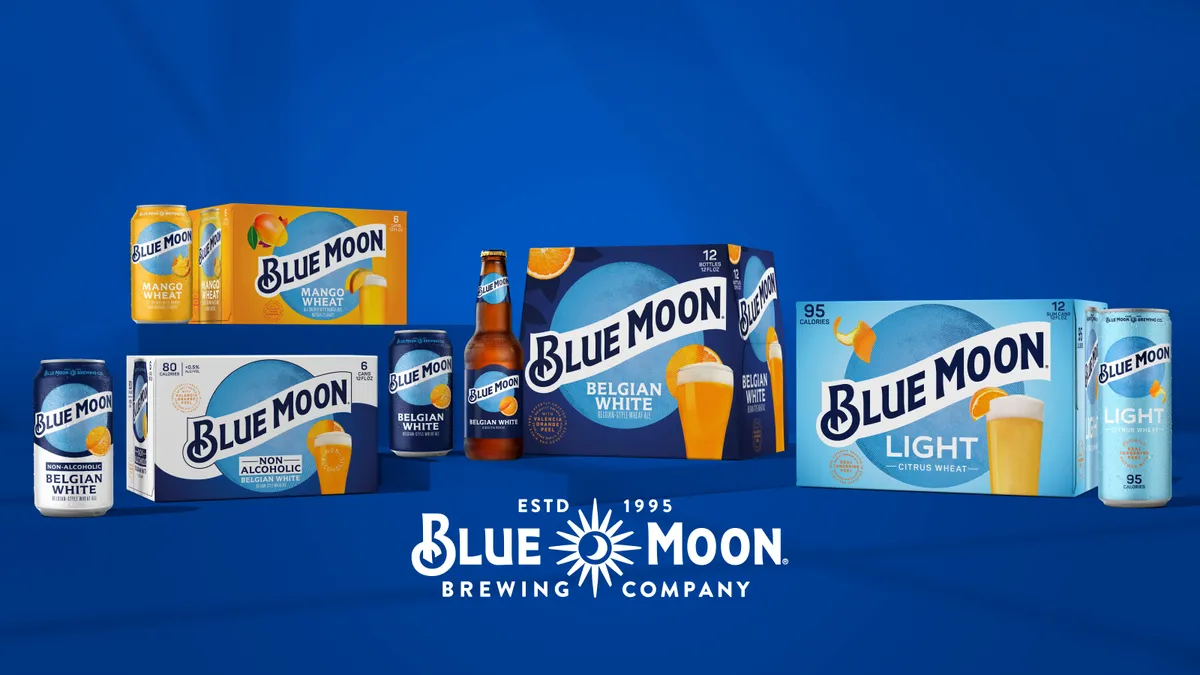
Molson Coors is revamping its Blue Moon beer packaging to create a more modern, streamlined look. The new design is “leaning hard on the stylized blue moon and banner text that is so linked to the brand” and is intended “to stand out more on shelves.” Each beer type’s packaging will prominently feature a fruit image, such as an orange or mango, indicating its flavor notes. Product testing shows consumers find this look more desirable, easier to locate in stores and that it increased their purchase intent, according to a company statement.
The update comes at a time when beer sales generally are down amid market share pressure from hard seltzers and ready-to-drink cocktails, but consumers are showing preference for “above-premium options.” New packaging for the entire Blue Moon family of beers will be released in February.
“Blue Moon sits in this unique position in above premium, with craft roots and mass appeal at the same time,” said Courtney Benedict, vice president for above-premium beer, in a statement. “In the past few years, we haven’t been telling a unified story, and Blue Moon’s new look brings all the brands together.”
A spirited change
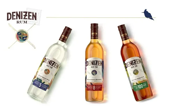
Another updated look comes from Denizen Rum. The bottle shape is the same as previous versions, but it’s made from lighter glass that uses a higher proportion of recycled materials.
The company said the updated imagery “mirrors the dynamic rums nestled inside each bottle” and “honors the brand's commitment to creating an elevated spirit.” Each product type has a label reflecting regional flora and fauna as well as a compass to symbolize Caribbean explorers.
Cookie crisp
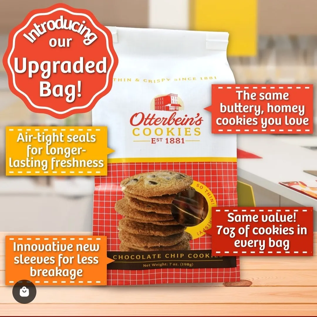
Baltimore-based Otterbein’s Cookies also is upgrading its packaging, reported WMAR. The 142-year-old company’s cookie recipe is the same but the different bags highlight the “ubiquitous red-and-white check pattern in an updated design,” according to an Otterbein’s Instagram post.
The new internal sleeves reduce cookie breakage, and the air-tight seal keeps cookies crispy and fresh, the company said. This packaging reportedly extends freshness by 3.5 months, resulting in a longer “best by” date for the products.


